Update Windows 10 Colors in Personalization Settings
Windows 10 Anniversary Update expands personalization color options by providing more choice where you can apply color. Here’s a look at what to expect.
Since Windows 10 launched at the end of July 2015, the operating system has remained a work in progress. The personalization options, in particular, have continued to evolve and are refined with each update. The Windows 10 Anniversary Update offers more options when choosing colors and themes.
In previous revisions of Windows 10, the window chrome and title bar color options were limited to one or the other. The November Update introduced the possibility for the first time to apply colors to the window chrome. Windows 10 Anniversary Update expands on these options by providing more choice where you can use color. In this article, we take a look at using them.
Apply Color Options in Windows 10 Personalization Settings
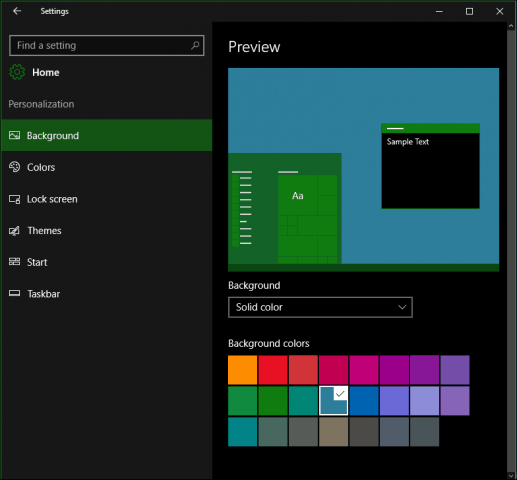
To modify system color options, go to Start > Settings > Personalization and then select the “Colors” tab. It offers a wide array of choices. The Accent color pallet provides 48 colors. Click any of the available colors to see a preview.
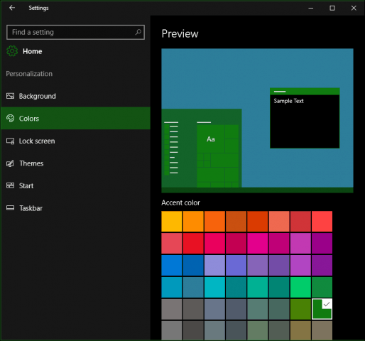
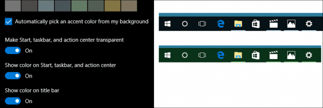
An Accent applies to areas of the interface such as tiles, selections, and the title bar. If you want, you can automatically have a color selected. Previous options for applying transparency to the Start, Taskbar, Action Center including display of color on the title bar are available.
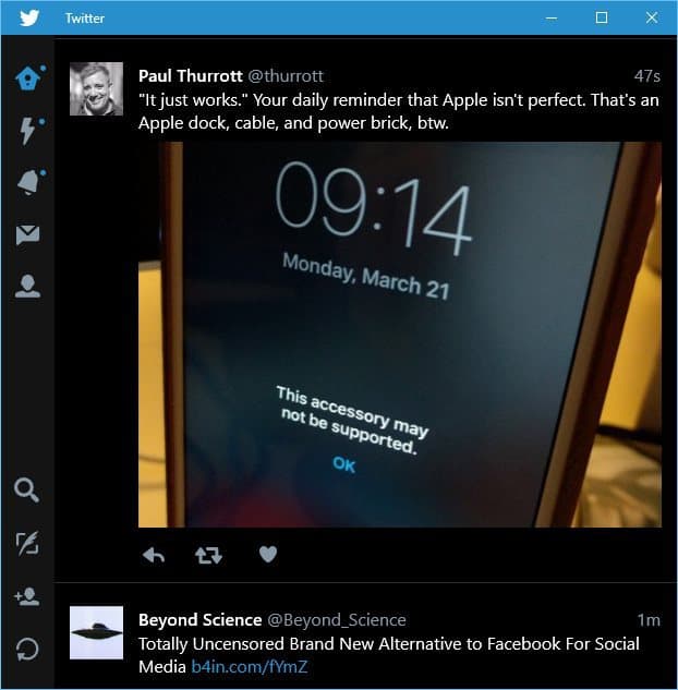
The Anniversary Update includes a new option for choosing a dark or light theme. Previously, this option was only available on an app by app basis. Applying either option is still not universal, though. Built-in apps such as Groove Music and Movies & TV require enabling dark or light mode. The same is for third-party apps like Twitter, too.
To get an idea, check out our article on how to enable the dark theme on the Twitter app in Windows 10.
For users who experience difficulty reading or viewing on screen items, Windows 10 includes high-contrast color schemes. When enabled the color contrast of text, hyperlinks, buttons, and selected text are highlighted, making them more distinct and easier to identify.

Other Color options are available within the Background tab under Personalization. You can choose a Solid color for your desktop background if the traditional imagery is distracting.
Overall, the color improvements feel complete and truly customizable in Windows 10 as far as the system option goes. Some Universal Apps still manage their individual color modes. The new Dark mode is a welcome improvement and provides better contrast when working with apps. So what do you think? Let us know your thoughts in the comments.


Learjet
June 5, 2016 at 1:28 pm
I’m happy to have more options. In the past, I have used a third-party software (Windowblinds) to customize my Windows interface, but I no longer find that necessary – even with the limited choices that are available in the pre-anniversary update version of Windows 10. As soon as I learned how to make my taskbar transparent, I uninstalled Windowblinds. Now it’s only going to get better yet!
drno
July 28, 2016 at 7:14 pm
“As soon as I learned how to make my taskbar transparent”
how? without a 3rd party app?
Jan
June 7, 2016 at 9:19 pm
Ah, there is still hope! I am also happy and will probably be happier when I see more screen shots of some of the possibilities, as I do not have Windows 10 yet and cannot experiment. But are the 48 colors in the accent color pallet really only the ones shown in the first screen shot in the article? Many of them seem to be duplicates or very close to that, so there certainly not 48. What a waste, when there could have been more diverse colors! I get the impression that whoever decided on the colors was more concerned to have them all somehow harmonize with each other than to offer a lot of choices. Still, mustn’t look a gift horse in the mouth, so I do find this recent offering very encouraging.
Now, if they would add the ability to make the desktop background a slide show of the pictures in My Pictures or whatever passes for that in Win10, I might even be tempted to go for it before the free offer runs out.
These Old Eyes
June 20, 2016 at 7:26 pm
Can anyone tell me if the Anniversary Edition provides a way to change the background color of dialog boxes and other windows such as File Explorer that display text? High contrast is the opposite of what aging eyes like mine need. When I tried Windows 10 all that was available was bright white. My eyes do better with a soft gray-green, which is what I am able to use in Windows 7.
These Old Eyes
August 3, 2016 at 1:31 pm
How will I know when I am updated to the Anniversary Edition? Does it include any way to select soft background colors?
All the High Contrast color options I was directed to by some smug MS developer are way too saturated to serve as window/dialog background colors for aging eyes that need Low Contrast.
Guess I’ll look into Windowblinds…
Aelicia
November 2, 2016 at 9:39 pm
I hate new update!!!! I hate it!!!!!
Adrian A.
December 26, 2016 at 9:15 am
I consider the Windows10 color theme a big, stupid setback, regress, how-to-tell more. It is UGLY, and makes me BLIND. Windows 98 was the best and eye/userfriendly appearance.
Donald York
March 16, 2020 at 9:07 am
I don’t grasp what is meant by “the window chrome” where you say “…the window chrome and title bar color options were limited to one or the other. The November Update introduced the possibility for the first time to apply colors to the window chrome.”
I’ll watch for replies, a sure sign I’m transformed from somebody who didn’t know you exist to a FOLLOWER!