How to Make a Pie Chart in Microsoft Excel 2010 or 2007

Pie charts are an effective way to analyze data sets visually. And since most people love pie, it’s a widely accepted format to present data to customers or management. All jokes aside, it might seem difficult to get started with a pie chart, but Microsoft Excel is an excellent tool for producing them with just a few simple clicks.
Make a Pie Chart in Microsoft Excel 2010 or 2007
Update: If you are running modern versions of Excel in the Microsoft 365 (formerly O365) subscription suite, read how to make pie charts in Excel.
First, you’ll need to write your list of data in Excel. This is pretty easy, one column is your description of the numbers, and the other column is your numbers. You can make it look snazzy by styling it from the Home ribbon, but this won’t affect our pie chart.
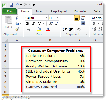

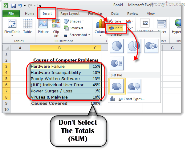
Select the data that you want to include in the pie chart. This literally means holding down the left mouse button and dragging a box around the data. Be sure not to select the cells where you totaled things up.
Once everything is selected, click the Insert ribbon and then click Pie and select whether you want a 2-D or a 3-D pie; and which template.

Customize your chart
Now your pie chart should show up on your spreadsheet. The next thing we’re going to do is customize the chart to make it more appealing.
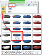
When you have the chart selected (click on the chart), Chart Tools will appear on the ribbon. This includes a total of three different tabs: Design, Layout, and Format.
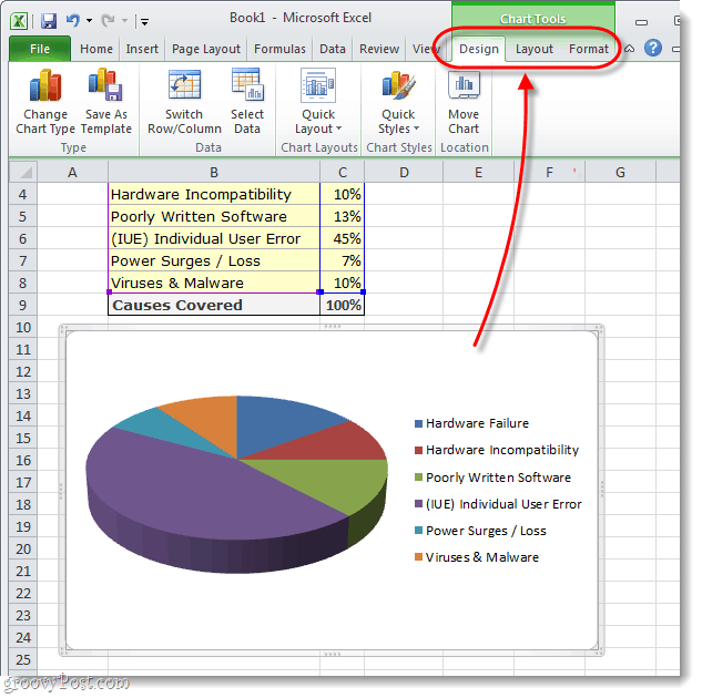

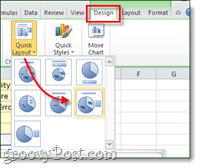
Each tab from the Chart Tools ribbon area will let perform several different customizations. The only way to really learn what you can do is to play around with the different settings for a while. But, as an example, I’ve customized my chart using the tools outlined in the three screenshots below.
Now you have a spiffy-looking pie chart in your Microsoft Excel spreadsheet. When it comes to making pie charts this attractive, it doesn’t get much easier than this. Do you have a favorite tip or trick for making pie charts in Excel? We’d love to hear it in the comments below.


8 Comments
Leave a Reply
Leave a Reply




grace kay
November 30, 2011 at 5:42 am
thanks! brief and very useful
sridarsh
July 25, 2012 at 10:24 pm
Thank you so much! it was very helpful
sd
August 7, 2012 at 3:23 am
thanks , made easy to understand
Mary
October 4, 2012 at 4:01 pm
how do you print the chart without the box around it?
uma devi
February 6, 2013 at 11:07 pm
Thank u so much..it was very useful
Michael Vilen
February 14, 2013 at 10:10 pm
If you want to use an image as fill in the pie, how do you fill the whole chart with one image? It seems that there is the same image on every single pie not one image over the whole chart. Do you have any solution for this?
Matt S.
February 28, 2013 at 8:33 pm
Did not work for me. I could never get the data to show up in the chart.
Kunal. Siddhawar
October 14, 2015 at 8:39 pm
That is very helpful to me and easy to explain others about this
Thank you so much…