A Guide to Conditional Formatting in Excel

In this guide you’ll learn how to use conditional formatting in Excel and some examples of when it’s best to use the feature.
One of the most useful features in Excel is conditional formatting. This lets you provide visual indicators for the data in your spreadsheet. Using conditional formatting in Excel, you can show whether data is above or below limits, trending up or down, or much more.
In this guide, you’ll learn how to use conditional formatting in Excel and some examples of when it’s best to use the feature.
Changing Cell Color with Conditional Formatting
One of the most common ways people using conditional formatting in Excel is the Highlight Cell Rules. As an example, let’s say a teacher uses a spreadsheet to keep a record of grades for a test.

As a simple spreadsheet, the teacher could just scan through the sheet to see which students passed or failed the test. Or, a creative teacher could incorporate a “highlight cells” rule that highlights passing or failing grades with the appropriate color — red or green.
To do this, select the Home menu and select Conditional Formatting in the Styles group. From this list, you can choose which rule you want to apply. This includes highlighting cells that are greater than, less than, between, or equal to a value.

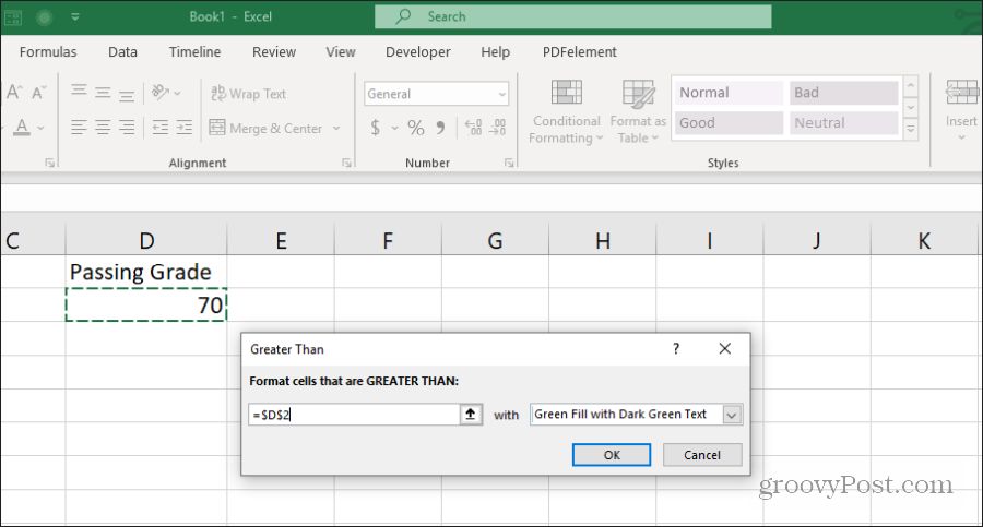
In this example, the teacher wants to highlight cells green if they’re greater than the passing grade which is in cell D2. Highlight all of the cells in column B (except the header) and select Greater Than from the Highlight Cells Rules menu.
You can enter a static value as the limit, or select a cell that contains the value. You can keep the standard “Light Red Fill with Dark Red Text” in the dropdown, select from any other custom color setup, or select Custom Format to set up your own.
You can see that this rule highlights all of the passing grades green.

But what about the failing grades? To accomplish this, you’d need to select the same cells and repeat the process above, but select the “less than” rule. Select the same passing grade cell, and make the color Light Red with Dark Red Text.
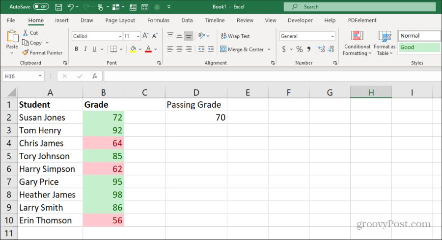
Once you’re done, the two rules applied to the data will appropriately highlight the grade data according to whether they’re under or over the passing grade limit.
Using Top/Bottom Rules in Excel
Another very useful conditional formatting rule in Excel is are the “Top/Bottom” rules. This lets you analyze any long list of data and rank the list in terms of any of the following:
- Top 10 items
- Bottom 10 items
- Top 10%
- Bottom 10%
- Above average
- Below average
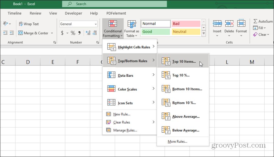
For example, let’s say you have a list of New York Times bestseller books along with reviewer scores in a spreadsheet. You could use the Top/Bottom rules to see which books were ranked one of the 10 best or 10 worst of the entire list.
To do this, just select the entire list, then from the Conditional Formatting menu, select Top/Bottom rules and then select Top 10 Items.
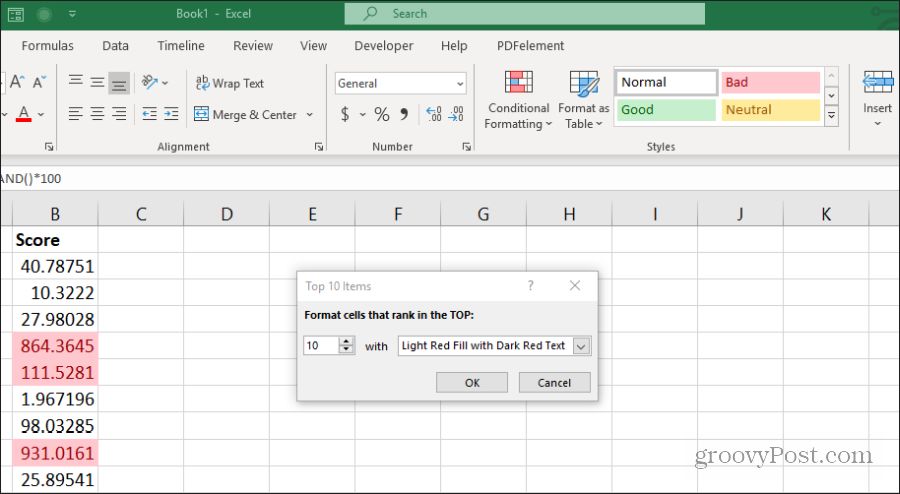
You aren’t limited to the top 10 items. On the configuration window, you can change this to whatever number you like, and you can change the coloring for the cells as well.
You can use the same approach as the previous section to show both top 10 and bottom 10 by adding a secondary rule and highlighting the bottom 10 red, while highlighting the top 10 green.
When you’re finished, at a glance you can see the best rated and lowest-rated on the list.

Using highlighting for highest or lowest items lets you keep your list sorted the way you like, but you’re still able to see the sorting (highest or lowest) at a glance. This is also extremely useful when you use the above average or below average rule as well.
Using Data Bar Conditional Formatting
Another very useful conditional formatting rule is the data bar formatting rules. This lets you transform your data cells into a virtual bar chart. This rule will fill the cell with a percentage of color based on the position the data point is above and below the high and low limits that you set.
For example, say you do a lot of traveling for work and you log the fuel you use during trips to specific states. This fill feature will apply a fill pattern for each data point based on your maximum and minimum data points as high and low limits. You can transform your fuel data cells into a bar chart using the data bar conditional formatting rule.
To do this, select the entire column of data, and select Data Bars from the Conditional Formatting menu.

You can choose from two different data bar formatting options.
- Gradient Fill: This will fill the cells in a shaded gradient pattern.
- Solid Fill: This will fill in the cells in a solid color pattern.
To configure this, just select the column of data you want to apply the fill to and select either a gradient fill or solid fill option from the Conditional Formatting Data Bars menu.
Once applied, you’ll see the gradient or solid fill applied to the cell of every data point.

The ability to convert spreadsheets data into an embedded bar chart has a lot of useful applications.
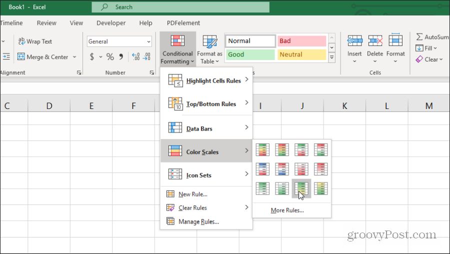
Using Color Scale Conditional Formatting
An alternative to using a visual bar chart option that the cell fill options provide is the color scale conditional formatting feature. It fills the cells with a gradient that represents whether that data point is at the low end or the high end of the overall data range.
To apply this formatting, just select the range of cells you want to apply the formatting to, and then select your color choice from Color Scales in the Conditional Formatting menu.
When you apply this formatting to a range of cells, it provides a similar visualization as the data bar option. But the colorizing of cells gives you a better overview of where every data point falls in a range.

The option you choose really depends on how you prefer presenting your data in the spreadsheet. A color scale like this is useful if you don’t really want your spreadsheet to look like a bar chart. But you do still want to see — at a glance — where in the range each data point falls.
How to Use Icon Sets in Excel
One of the most creative features of conditional formatting in Excel is the icon data sets. These let you implement an icon to visualize something about the data in the chart.
In the Icon Sets menu in Condition Formatting, you can choose from a wide range of icon sets.
![]()
These icon sets will display inside each data cell to represent wherein the overall range of data that item falls. If you select the arrows, you’ll see a red down arrow for low data. An up green arrow for high data. A yellow horizontal arrow for mid-range data.
![]()
These colors are completely customizable if you choose to. To customize, just select the column of data and select Manage Rules in the Conditional Formatting menu.
All of these conditional formatting options let you visualize the data in your spreadsheets. This helps to better understand what you’re trying to represent with the data at a single glance.