

Step 1
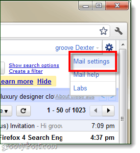
Login to your Gmail. At the top-right of your Gmail window, Click the options menu (wrench) and Click Mail settings.

Step 2
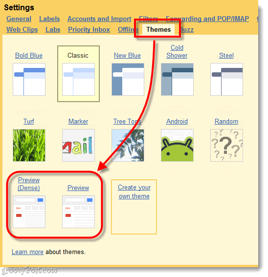
From the settings tabs, Select Themes. Now go down and Click either of the Preview themes. They are called:
- Preview (Dense) – aka condensed
- Preview
Tip: Dense is better for small screens.

Done!
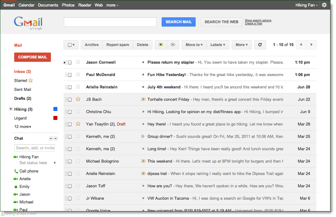
As soon as you Click either of the themes it should instantly apply. Keep in mind that this is just a preview, so there may be a few changes still before the theme becomes the new default.
Here’s what the inbox looks like, and below is what “message view” in opened emails will look like.
Huh… Is it just me or does this new UI look EXACTLY like Goole+?
13 Comments
Leave a Reply
Leave a Reply





Pat Uelmen Huey
July 4, 2011 at 8:07 pm
Dexter, thanks for the review. I have to say that I don’t really see any difference in clutter between the old Gmail and the new; they both look too busy to me, except that there’s more white space in the new theme, more BUTTONS WITH CAPITAL LETTERS, and less eye appeal. The calendar looks similarly unimpressive and channels iCal rather than appearing to be a leaner, cleaner Google calendar. Do you know if they are planning on having different themes for the “new” Gmail and calendars, or is this just an effort to unify the look with Google+? Thanks for posting!
MrGroove
July 5, 2011 at 12:00 pm
I would guess they will have a few different themes once this thing launches however they will probably hold off on that until they have a solid “theme” and launch of Google+ (plus) before they adopt new themes for all the child services like GMAIL, Google Apps, Blogger etc….. Only a guess at this point…
Gordon Yorston
July 5, 2011 at 7:58 am
I frankly prefer the “old” version rather than the new, rather white preview view. Maybe it’s a matter of getting used to the new look but I don’t think it makes it less cluttered than before
MrGroove
July 5, 2011 at 11:58 am
It has taken a few days for me to get used to it and yeah… the jury is still out for me on this one. It looks A LOT!!! like google+ so I’m guessing they are trying to tie everything together before PLUS goes public….
Also remember this is still the “Preview” so it’s probably not the finished default theme.
Erehwon
July 5, 2011 at 8:13 am
I wonder if the preview has been pulled as I don’t see the preview or dense options listed under themes for me.
MrGroove
July 5, 2011 at 11:54 am
Hmm odd. I just tried on my “backup” GMAIL account it it’s listed for me. Just enabled it. I also just tested it on my Google Apps Account and it was there also.
What country are you in? Are you in the US? Only thing I can think of.
groovinJackman
July 5, 2011 at 1:11 pm
Note: If you are using the Gmail labs feature that puts your chat box on right, disable it. Makes this look much better.
vic gundotra is lame
July 5, 2011 at 2:57 pm
i think it sucks … you here me Vic …….. it sucks
Erehwon
July 5, 2011 at 5:53 pm
MrGroove – Yea in the US. I’ll post a SS if you want to to a peek.
MrGroove
July 5, 2011 at 6:16 pm
Yeah that would be great. Dump it up on http://min.us and shoot us a link. Perhaps someone from google will see it and hook ya up (or fix it).
nismo
July 8, 2011 at 12:15 pm
has that appeal just cause its new… but its way more cluttered imo and i notice a lot more ads in the new version
thanks for that tip on disabling chat on the right, i think that might help a bit… i still prefer the old version far more
Face Lift
July 18, 2011 at 3:19 pm
I like it, thanks for the “how-to”!
Laura
July 27, 2011 at 2:19 am
Okay, I can’t get it. What am I doing wrong? I don’t have preview themes available to me (using IE 8).