How To Get Google Chrome’s Old Right-Click Menu Back
In a recent Google Chrome update, the right-click Context Menu has been changed for the worse. If you’re not a fan, take matters into your own hands and change it back.
Update: Since this article was originally written, we are now on Chrome version 91, and this process no longer works.
In a recent Google Chrome update, the right-click Context Menu has been changed. The new style is more touch-friendly with extra white space between the items. However, if you’re not a fan of it, here’s how to revert to the old style.
Right-click Menu on Chrome
Since the update, when you right-click anything in Chrome, you’ll get this ugly-looking context menu with a white space between items. This makes navigating Chrome on touch interfaces easier but annoying on traditional computers.

For some reason, Google decided not to include an obvious way to turn this new style off. So, you need to take matters into your own hands and fix them. Here’s another example of how annoying it is.

Get the Old Chrome Right Click Menu Back
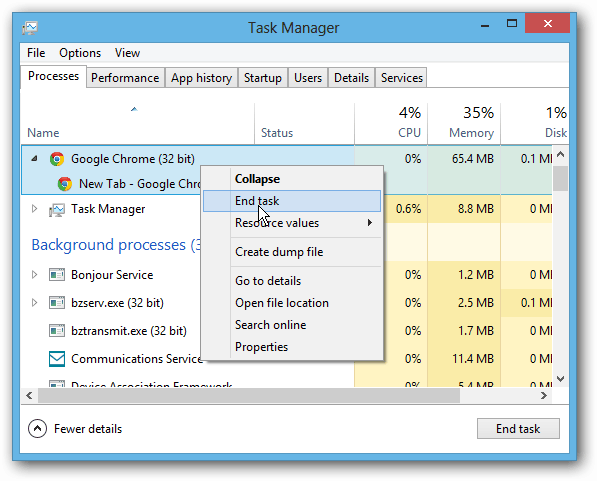
First, make sure all instances of Chrome are closed out. This is important for this to work. In fact, you might want to open Task Manager and ensure all instances are closed.
Right-click your Google Chrome shortcut and click Properties.

In the Shortcut window that comes up, the Shortcut tab should already be selected. In the Target field, scroll to the end of chrome.exe, hit the Space bar, then type or copy and paste the following:
--disable-new-menu-style

Click OK, launch Chrome, and you’ll see the right-click context menu is back to normal. It will stay that way unless you go back into the shortcut Properties and remove the parameter.

I find reverting to how the context menu uses a traditional desktop or laptop computer with a mouse and keyboard. But, when using a touchscreen interface, the new style actually works much easier.
What do you think about the new style? Do you like it, or are you going to revert it back? Leave a comment and let us know!


Mike
April 11, 2013 at 7:37 am
excellent walk through Brian. Another site was so confusing, many could not get it to work. The necessary steps require exact directions. Actually, I prefer the double spacing even without a touch screen.
Brian Burgess
April 11, 2013 at 2:08 pm
Thanks Mike. It’s easy to do, but indeed needs to be specific.
RG
April 11, 2013 at 8:15 am
I thought something was different! Took me a while to actually SEE it. Menus shouldn’t draw attention to themselves. On desktop interfaces I’m used to the distance between where I right-clicked and where what I want is on the list. Click-move-click. Done. Now I have to read the items and align my mouse. It takes more eyeball movement to read the list.
I’m sure this is fantastic for touchscreens, but it’s a nuisance for desktop. Google has that great density option in Gmail and Drive. Why can’t I choose Comfortable/Cozy/Compact for my menu?
I shake my fist at you, Google! Bad design flaw, bad dog!
Rafael Gomes
April 12, 2013 at 5:19 pm
For me, it did not work. I am having issues with the ” in the beginning and at the end… the –disable-new-menu-style must be inside or outside the ” ???
Marcus Fernagan
January 27, 2024 at 3:05 am
This didn’t work, I had to go to chrome://flags/ and disable Chrome Refresh 2023.